Web Design Principles: The basics you need for a high-quality website.

We’ve come a long way since the first few websites on the internet. While I can’t say I had the pleasure of dealing with the internet of the 1990s, I do remember the websites of the early 2000s — and wow, things have improved. Back then, having a couple of colors, gifs, and interactive sections was amazing. Now anyone can make a website. You don’t have to be a developer or a software expert; you don’t even need to know what coding is, let alone how to do it. The one thing you do need to recognize is how web design and content have shifted. Currently, the emphasis on user experience and SEO (Search Engine Optimization) dominates the Web. With a good website, you can help your business establish its credibility and relationship with potential customers.
During an interactive workshop for our community of entrepreneurs, Abbey Mui, an Ascender Incubator participant and founder of re:Bloom, shared best practices for designing and launching a business website. re:Bloom is a nonprofit web agency whose mission is to make web services accessible, affordable, and sustainable. The organization connects volunteer web developers with women- & minority-owned small businesses to build out tech solutions in 10 weeks. The idea for re:Bloom came to Abbey in 2020 when her mother’s small business needed a new and updated website. Through helping her mother, Abbey learned that 40% of US small businesses have no website, which hurts revenue, sales, and growth for the businesses that build their local economies. Moreover, Abbey found only a few resources that cost-effectively train small business owners to create and maintain their own tech.
Abbey walked us through design principles for creating simple but effective business sites. She also covered the important pages that every site needs and layouts that can create user-friendly experiences. Keep reading to pick up the basics needed to design a website from scratch or learn new tips to refresh their website’s design.
Start With A Plan
When planning your website, it’s important to know your goals, how you can achieve them, and what kinds of pages are necessary. Your website goal(s) should influence how you plan and design your website. For example, do you plan on collecting emails, gaining leads, or selling products? How do you plan on achieving these goals? You have the options of informing, providing testimonies, or showcasing a product. After all that planning, you should consider how you want to organize all that information. Pages to consider are a Home page, About page, Product page, and Services page.
What Makes A Website Effective?
The purpose of your website is to keep the visitor engaged, all while being sure that the message you want to communicate can reach them. First impressions matter — one study reports that it takes less than two-tenths of a second for an online visitor to form a first opinion of your brand — so you want to design a site that captivates visitors from the start.
According to Abbey, every entrepreneur should strive for simplicity when designing a site. You don’t want to overcomplicate a website and confuse intended users or draw them away from your website.
Another common characteristic of effective and engaging websites is consistency. Whether it be your color pallet or the type of fonts that you use, consistency helps a user easily navigate a website.
The most effective websites have also thought about site accessibility (color contrast, alt text, closed captioning, tab accessibility, etc.), mobile responsiveness (how your site appears on a smartphone or tablet, and SEO or Search Engine Optimization (how quickly Google and other search engines pull up your website and where it ranks in searches).

User Experience
Have you ever gone through a website and been confused about the order you have to click to get where you need to be? Creating a positive user experience prevents visitors from getting frustrated with or lost on your website. Things to consider are user flows (the path taken by a user to complete a task), call-to-actions (e.g., Subscribe to Our Website, or Call Now for a Free Tour), “oops” buttons (like a Back button or Save for Later button in a cart), and visual queues. Here are a few questions to ask yourself as you plan your website:
- How do you want the user to interact with your content?
- What information do you want to share with your user, and in what order?
- What information or actions do users expect to see on a site for my kind of business? For example, a menu and online ordering are standard if you own a restaurant.
- What is the end goal of having a user come onto your site? Some examples of end goals are having a user make a purchase, sign up for something, or call a number on the website.
Design
Effective websites are consistent websites. So as you design your website, you want to make sure your branding is consistent. When coming up with a design, the angle should be strategic more than aesthetic. Your website design should be tailored to your industry and the target market you’re trying to attract. For example, if you have a clothing brand, you’d want your website to have the ability to showcase your clothes and filter different categories like a kids section or a sale section. If you provide consulting, it would make more sense to have your previous projects listed and reviews from past partners. Think about what your brand represents and what kind of message you want to send to your visitors. An excellent way to keep consistency is to have a brand kit, which includes colors, typography, your company’s logo, the kind of shapes you want to use, and even standard messages like taglines and value statements.

Common Pages
Each page on your website should have an objective. Your homepage should serve as a teaser that entices visitors to explore more and a trustworthy guide that helps visitors navigate through the rest of the site. Your goal for the homepage is to capture people’s interest and keep them on your website. Consider having clear next steps and calls-to-action, like “Learn More” or “Sign Up.” Additionally, you’ll want some attention-grabbing content on your main page. A short video that tells your story or highlights your most popular products is an excellent piece of content to include on your homepage.
Another example is the Contact Us page. This page exists to provide your visitors with information on how they can get in touch with you. You might include your contact information (phone, email, social media), a contact form for direct inquiries, or your hours.
At the end of the day, when designing your pages, you want to ask yourself: What is the goal? & How do I want users to reach that goal?
Wireframes
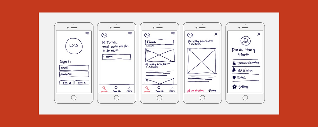
It’s important to start planning your website with prototypes, specifically wireframes. What is a wireframe, and what does it do? According to Orbit Media Studios, they’re “simple black and white layouts that outline the specific size and placement of page elements, site features, conversion areas and navigation for your website.” Essentially, wireframes are a simple, clear-cut blueprint that you can follow. These can be as basic or detailed as you would like and need to help you build your site. Some people prefer to draw their frames a paper, while others like to plan their wireframes using apps on a tablet or computer. Some trusted tools for creating a website wireframe are Adobe XD, Figma, Balsamiq, and Invision. Wireframing allows you to prototype your website and collect feedback before spending too much time and money making a fully-functioning site.

DIY: No- & Low-Code Web Builders
Wireframing is still an important part of the website building process, but if you’d like an easier and more accessible platform that provides templates, using a no- or low-code web builder is your best route. If you plan to use this option, you’ll want to keep your website simple and include only the most important pages. Some platforms that have modern designs and are easy to operate are Squarespace, Wix, Shopify, and WordPress.
The internet has transformed the way businesses run, and for small businesses, it is an essential way to connect with the community that surrounds them.
If you’re looking for more guidance on designing your website, connect with re:Bloom!
Want more? Here’s Abbey’s full presentation.
https://medium.com/media/e05cb3ea6fa133081e4a31d4290a6186/href
Connect with us
Learn more about Ascender: https://ascenderpgh.com/
Sign up for our newsletter or send us a note: info@ascenderpgh.com
Follow us: Twitter — Facebook — LinkedIn — Instagram
From fledgling tech companies, healthcare innovators, and nonprofits to makers, creators, services and shops, Ascender is for Pittsburgh’s entrepreneurs. We help businesses of all types in the Pittsburgh region start and build a business through education and connectivity. See how Ascender can help you.
Website Building Blocks was originally published in Ascender on Medium, where people are continuing the conversation by highlighting and responding to this story.

